

From Legacy to Usability
Pollock-Krasner Foundation
Client: Pollock-Krasner Foundation
Type: Nonprofit, Arts + Grantmaking
Role: UX/UI Designer (at North Street)
Team: UX Researcher, UX/UI Designer, Developer
Platform: Web
Not your typical arts foundation site. Not your typical audience..
The Pollock-Krasner Foundation needed a site that could do more than preserve legacy — it had to actively support artists around the world. The old site was content-rich but confusing to navigate, especially for first-time grant applicants. Key info about eligibility, awards, and even the artists themselves was hard to find. Mobile experience was clunky, and too many questions were going unanswered.
Key challenges we tackled:
🎨 Legacy imbalance — Lee Krasner and Jackson Pollock weren’t equally represented visually or content-wise.
🧭 Common misconceptions — Many thought you had to be an abstract artist or have financial hardship to apply.
📱 Mobile friction — A large portion of traffic was on mobile, but the experience wasn’t optimized.
❓ Too many repeat questions — The FAQ and grant content didn’t reduce email inquiries as intended.

The procces
Discover → Research → Define → Design → Deliver
→ Kicked things off with deep discovery: stakeholder interviews, Typeform inputs, and competitive audits shaped our understanding of PKF’s challenges
→ Mapped core audience segments — from grant-seeking artists to museum curators — and uncovered where the site was falling short for each
→ Identified common misconceptions: eligibility confusion, authentication questions, and lack of clarity in the grant process
→ Structured a new site map that guides each user type with clearer CTAs, intuitive paths, and better content hierarchy
→ Grounded the visual direction in Pollock and Krasner equally — making sure legacy and usability work hand-in-hand

Research & Discovery
Understanding artists, legacy, and UX friction before moving pixels.
We kicked things off with a deep discovery phase — gathering stakeholder input, reviewing analytics, and running a full audit of the existing site. The goal: understand how users were navigating the current experience (and where they were dropping off).
Then we dove into
→ Reviewing Typeform input from stakeholders to surface recurring user confusion (authentications, eligibility, misconceptions)
→ Conducting peer foundation audits (Joan Mitchell, Warhol, Gottlieb, etc.) to benchmark navigation, legacy balance, and grant flows
→ Identifying mobile bottlenecks and accessibility issues that affected 40%+ of users
→ Mapping primary audiences — from artists to scholars — and their content needs
User feedback, unfiltered.
Turning honest confusion into UX clarity.
The Typeform responses from PKF’s internal team revealed what wasn’t obvious on the surface: artists and institutions were confused — not just by site layout, but by fundamental misunderstandings about what PKF actually does.
What came up again and again:
→ People think you need to be an abstract artist to apply
→ Many assume PKF offers emergency grants
→ There’s a belief that financial need is a requirement
→ A huge volume of inquiries are about authentication — even though the foundation doesn’t offer it
→ Applicants often felt unsure about what qualifies as a “professional artist” or valid reference
These patterns became the foundation for how we reshaped language, page structure, and the overall user flow — aiming to answer questions before they get asked.
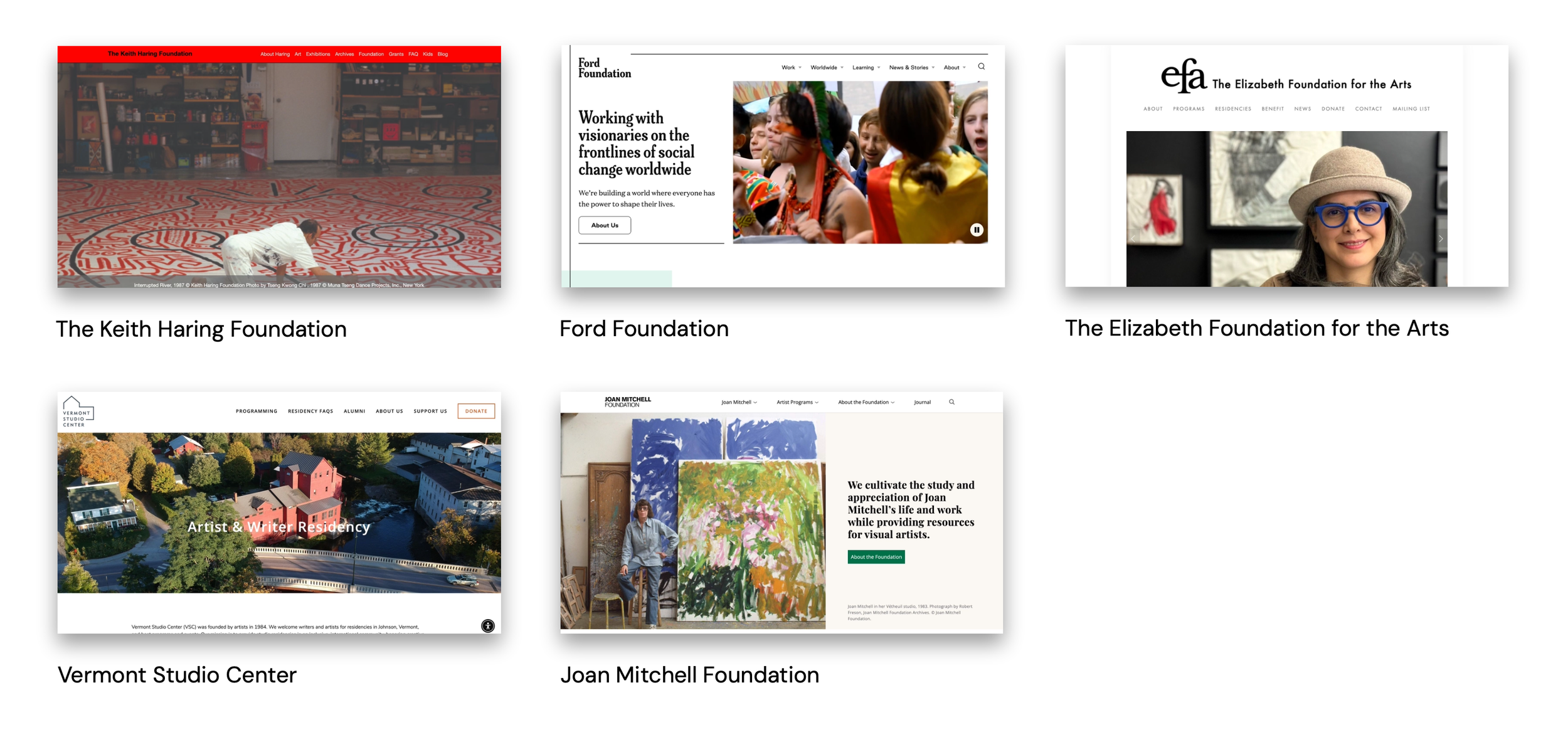
Peer Analysis
Before diving into design, we reviewed how other artist-endowed foundations structure their digital experience — from navigation and grant clarity to legacy representation. This helped us define what PKF needed to stand out: a balanced, accessible, and artist-first platform.


What We Compared
To make smart design decisions, we ran a focused peer analysis of other artist-endowed foundations — including the Joan Mitchell Foundation, Warhol Foundation, Gottlieb Foundation, Dedalus Foundation, and others.
We mapped out 10+ UX categories — from homepage hero messaging and grant clarity to artist presence in navigation, content depth, and mobile usability.
This helped us identify where PKF stood out — and where it needed to level up.
Many peers buried grant info behind dropdowns or gave disproportionate space to one artist.
We saw a clear opportunity to bring balance, clarity, and structure to the forefront — while keeping the experience visual and artist-first

What Stood Out
Our deep-dive revealed areas where PKF could grow —and where peer foundations were already ahead.
📱 Mobile Experience
Despite more than 40% of visitors coming from mobile, the old site was not fully optimized.
Touch targets were inconsistent, and some key pages lacked responsive layouts — especially in the grant application flow.
🖼 Legacy Balance & Visual Storytelling
Many peer foundations leaned heavily on one artist’s narrative. PKF’s site underrepresented Lee Krasner, visually and structurally.
We saw an opportunity to create a more equitable legacy experience — balancing both artists throughout.
📬 Engagement & Conversion
There were no standout CTAs, no mailing list signup, and minimal ways to interact with the Foundation outside of applying.
Peer sites used Instagram embeds, newsletters, and spotlight modules to deepen engagement. This was a clear gap.
🔍 Content Depth & Navigation
Important content like eligibility, FAQs, and artist history was often buried or scattered.
Other sites had dedicated artist sections, searchable archives, and curated timelines — giving users clearer, faster access.
Where we saw opportunity
With a clear set of UX gaps and content challenges in front of us, the redesign wasn’t just about visuals — it was a chance to create a site that respects legacy, empowers artists, and makes information instantly accessible.
The goal? Support creative growth while telling a clearer, more balanced story
Here’s what we focused on
Clarifying the grant application journey for both individual artists and organizations
Balancing the presence of Pollock and Krasner across the site — in visuals, navigation, and content
Improving mobile experience and accessibility across all major user flows
Reducing confusion around FAQs, grant types, and eligibility through cleaner IA and copy
Building modular content blocks that PKF can scale internally, without needing outside dev help
This set the direction for a new Pollock-Krasner Foundation —more accessible, more balanced, and designed to support artists from the very first click.
Key User
From first-time applicants to scholars and curators — here’s who the site needed to serve.
We identified five core user groups through stakeholder input and discovery research. Each came to the site with different goals — some looking to apply for grants, others searching for legacy information or ways to collaborate. This user matrix shaped our approach to navigation, content layout, and language throughout the redesign.

Simplifying the Structure
After reviewing analytics and internal input, we restructured the site’s navigation to reduce friction and align with how artists, scholars, and institutions actually browse.
The original site architecture buried essential info — like grant guidelines, how to apply, and artist history — under generic dropdowns and text-heavy layouts.
Now, visitors can explore the firm by who they need, what they need, or where they’re going — all backed by a lean, scalable layout behind the scenes.

The new IA brought clarity through:
Distinct entry points for different audiences (artists, organizations, researchers, museums). A dedicated “Apply” section with simplified steps and clearer language. Reorganized legacy content, balancing Pollock and Krasner equally. Cleaner mobile paths, reducing taps and visual clutter
Now, visitors can explore the site by what they need, not just where it lives — all built on a modular and scalable IA that works on any device.
Who We’re Designing For ?
Lisa, 42
Each audience came to PKF with different goals, expectations, and blockers. We shaped the site around their needs — helping them move confidently through the grant process, learn about legacy, or connect for future collaborations.
Museum Director
Goals: Explore ways to partner with PKF on an upcoming exhibit.
Frustrations: Doesn’t know who to contact or where to start. Legacy content is dense and hard to filter.
Needs: A direct path to collaboration info, a clear contact page, and strong artist background materials.
Andrés, 29
Prospective Artist Applicant
Goals: Apply for a grant to support an upcoming project and learn if he’s eligible.
Frustrations: Struggles to understand the steps, deadlines, and what qualifies as a “professional artist.”
Needs: A clear, step-by-step application flow, transparent eligibility rules, and examples from past grantees.
Dr. James, 58
Scholar / Researcher
Goals: Learn more about Pollock and Krasner for an academic paper.
Frustrations: Thinks PKF might authenticate a painting — which they don’t. Legacy materials are scattered.
Needs: Centralized artist archive, a clear note about non-authentication, and a smooth reading experience across devices.
What We Focused On
To guide design decisions, we prioritized the overlap between what users needed, what stakeholders hoped for, and what could be built realistically in the first release — without sacrificing flexibility down the road.
Now
The must-haves — high-impact and critical for launch.
Restructured navigation for artists, organizations, and scholars
Simplified grant application flow with clearer eligibility messaging
Improved mobile experience across all major content types
Balanced visual presence of Pollock & Krasner
Clarified non-authentication policy and reduced FAQ confusion
Later
Features with clear value that could roll out post-launch.
Interactive grant finder or filter tool
Expanded grantee showcase gallery
Enhanced SEO strategy for artist archives
Add Instagram or multimedia embeds to deepen engagement
Next
Nice-to-haves for scale or future partnership opportunities.
Collaborator portal for museums and curators
Exhibit request form and integrated calendar
Translation-ready architecture for future global audiences
Before the Redesign
The site felt dense, outdated, and hard to navigate.
The content was all there — but visitors had to dig through menus, guess at eligibility, and decipher legacy information on their own. The experience felt more institutional than artist-focused, especially on mobile.
What wasn’t working:
🧭
Buried Navigation: Important sections like Grant Info, Apply, and Artist Legacy were hard to find or grouped under unclear headings. There were no distinct paths for different user types.
🎨
Inconsistent Visual Language: The site used outdated design elements with no clear hierarchy, low contrast, and an unbalanced visual presence between Pollock and Krasner.
🧩
Fragmented Experience: The site lacked a unified system. Pages felt disconnected in tone and layout, and mobile users faced real friction, especially during the application process.

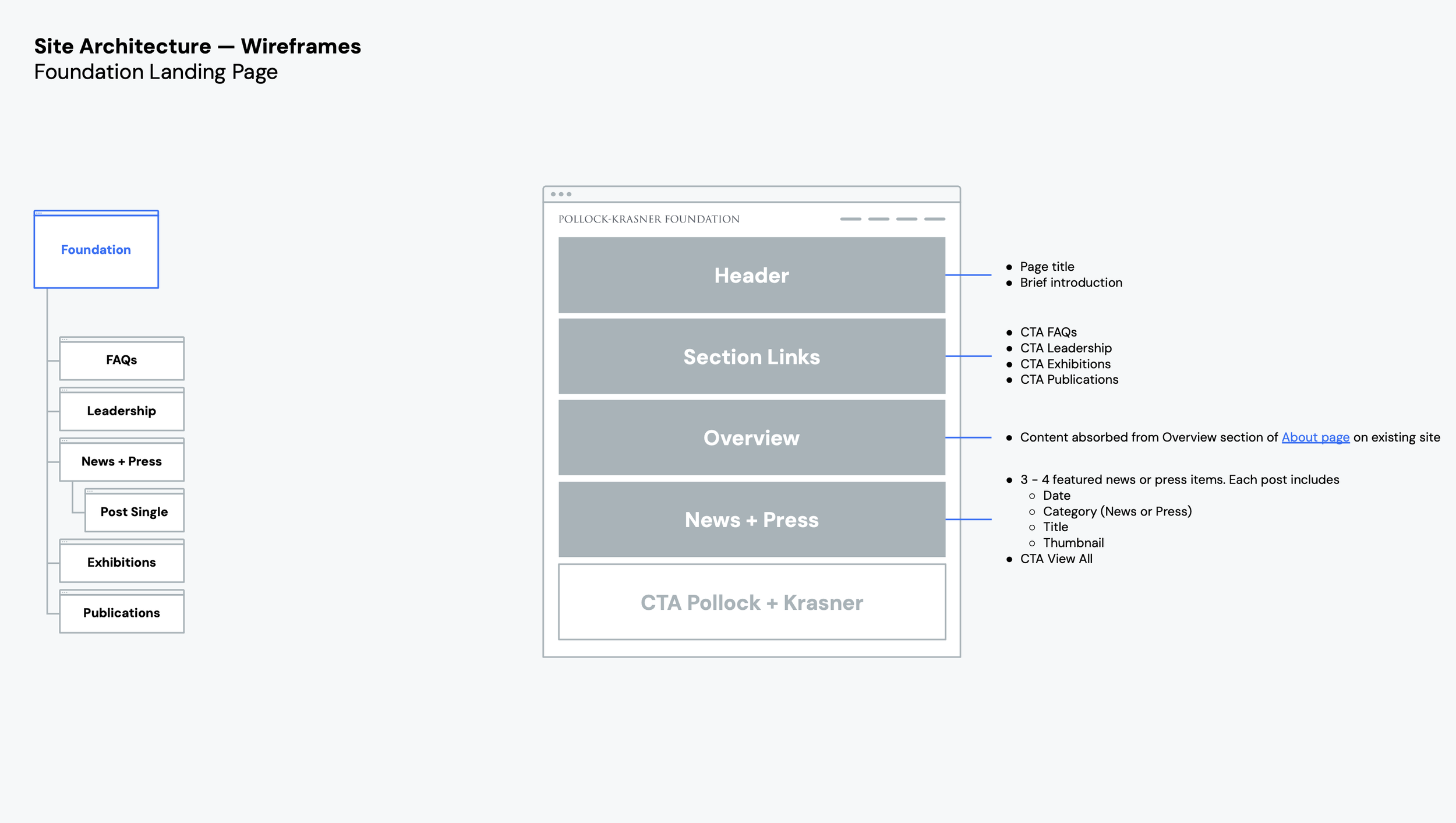
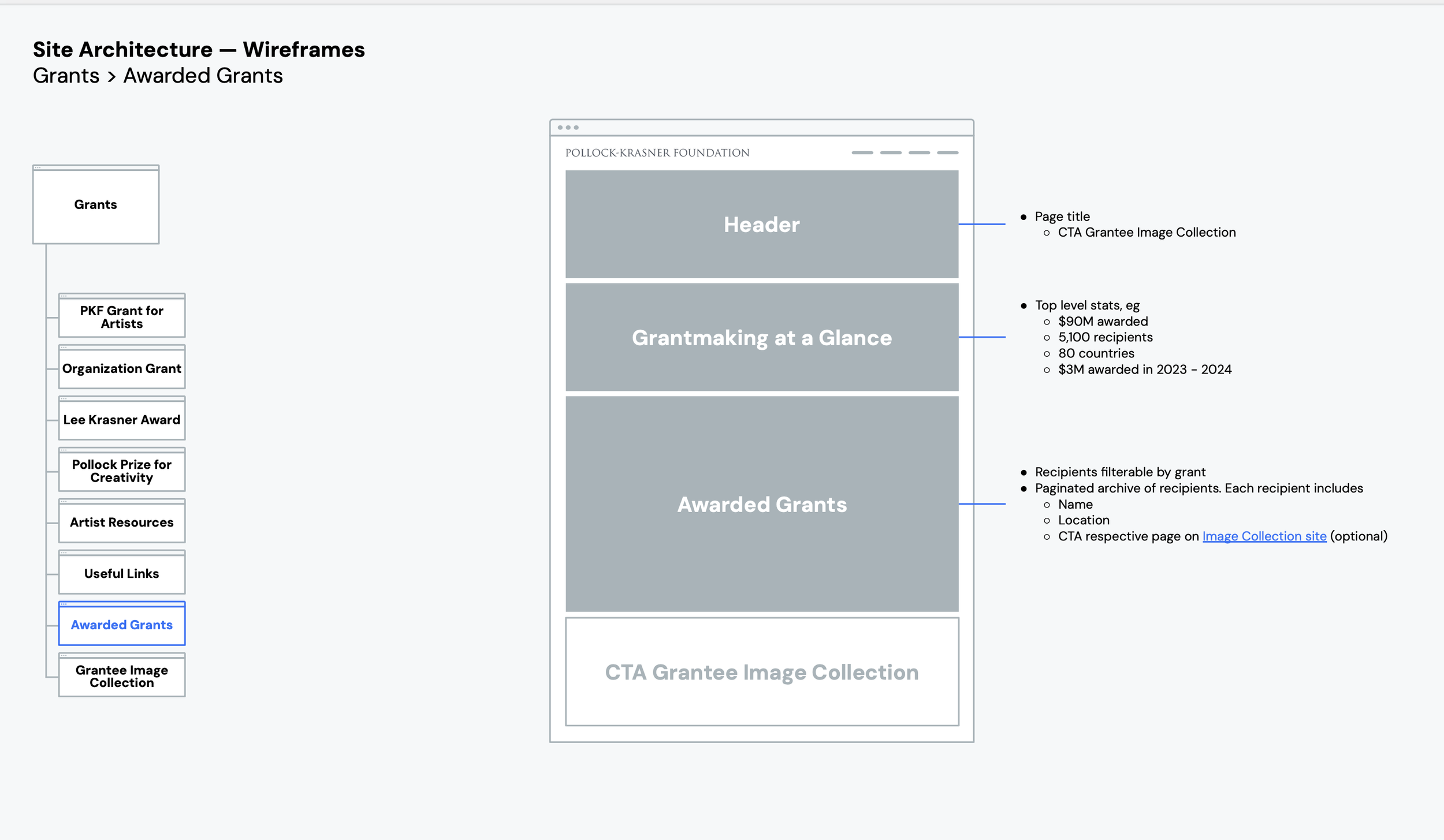
Low-fidelity wireframes we proposed
To kick off the design phase, we mapped out wireframes that focused on structure, not styling — giving both the client and our team a clear view of layout priorities early on.
These low-fidelity layouts emphasized clarity, usability, and content hierarchy — especially for key flows like applying for grants, viewing past recipients, and navigating artist legacy content.
The goal? Validate layout logic and real user flows, not pixel-perfect visuals.
It also gave the team room to gather early feedback from stakeholders, simplify decision-making, and reduce guesswork before diving into visual design.


Client Ideas vs UX Direction
What We Suggested
Balance Pollock and Krasner equally across the experience — visually and structurally.
Split into clear paths by audience (individuals vs. orgs) for better wayfinding.
Proposed a bold but clean system — legible typography, flexible layouts, and subtle color use.
Added a dedicated legacy space to educate, inspire, and reduce authentication confusion.
Agreed — noted as a “Next” phase idea to layer in social proof and artist energy.
What the Client Wanted
“Make Pollock the visual anchor on most pages.”
“Group all grant types on one page for simplicity.”
“We want the site to feel artist-forward but classic.”
“Not sure if a ‘legacy’ section is needed.”
“Instagram feed might be nice.”

Setting the Visual Direction
The design needed to do a lot — respect the legacy of two iconic artists, support dense grant content, and stay flexible for future updates. So, we built a visual system that felt structured but editorial — clean enough for press and funding details, yet expressive enough to honor the creative energy behind PKF.
We focused on:
A muted, modern palette that doesn’t compete with artwork
Typography that balances structure and personality
Layouts that could handle everything from application steps to legacy storytelling
Components built for scalability and CMS-friendly editing
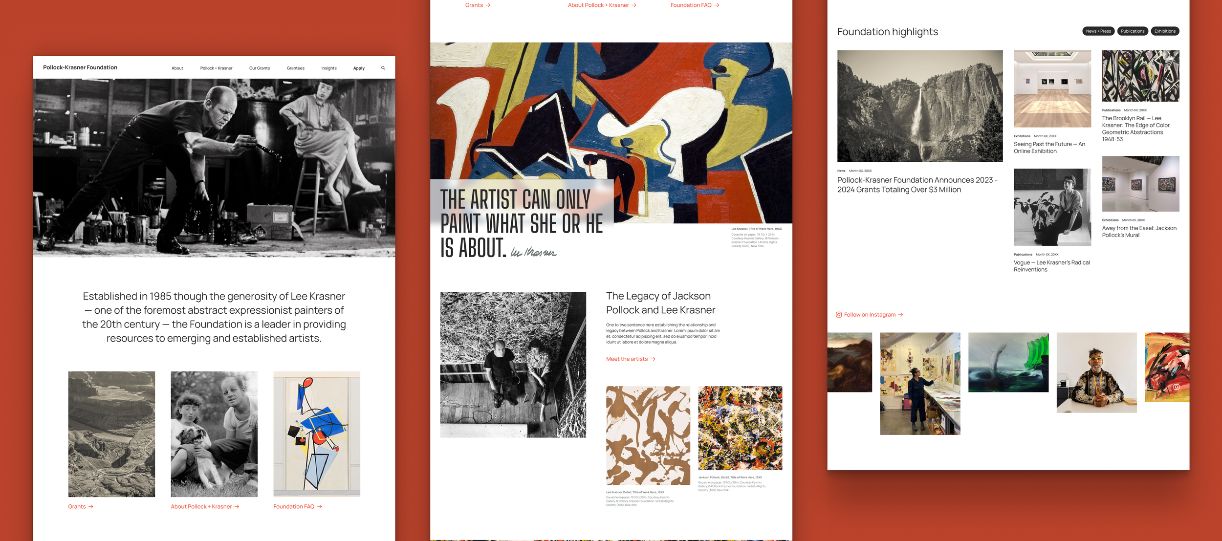
A homepage that speaks to every visitor
We designed it to do three things well:
Tell PKF’s story quickly — who they are, what they do, and why it matters
Guide users into the right grant flow or legacy section without second-guessing
Feel visually aligned with the artistic roots of Pollock and Krasner — without overdoing the abstraction
Designing clarity into the core grant experience
The grants pages were big ones. It had to be informative, supportive, and actionable — without overwhelming the user. We knew artists were often unsure if they qualified, what materials were needed, or when to start.
So, we broke it down:
A clean intro explaining who the grant is for
Clear callouts for eligibility, timeline, and requirements
Modular blocks to support easy scanning (and future updates)
A CTA that doesn’t shout — it invites

Structuring the Foundation’s story for clarity and scale
Foundation Overview page had a lot to say — about grants, exhibitions, history, awards, and impact. The challenge was turning that into a clean, readable layout that builds trust without overwhelming.
So, we broke it down:
A concise intro that explains who PKF is and what they do
Highlight stats that showcase scale and reach — $90M+ awarded, 5,100+ grants, 80+ countries
Clear sections for news, exhibitions, and publications
Modular content blocks to support future updates without breaking flow
Photos that feel alive — showing the artists and orgs that PKF supports in real-world contexts

What We Took Away
This wasn’t just a redesign. It was a chance to rethink how an arts organization talks to two very different audiences — creatives looking for support and institutions preserving legacy.
🟡 Poor hierarchy = broken flows
Eligibility info was buried, CTAs were inconsistent, and FAQ links felt like afterthoughts. We restructured flows so users could self-identify quickly and reach the right content in 1–2 clicks.
⚖️ Visual weight isn’t just aesthetic
Pollock’s name dominated the old layout. Our updated structure gave equal presence to Lee Krasner, using typography, layout weight, and naming conventions to subtly rebalance user perception.
🛋️ Tone is UI too
No flashy animation, no gradients. The site feels premium because of whitespace, legibility, alignment, and restraint — not just visual styling. That intentional simplicity made trust the hero.
🧩 Modularity reduces content debt
We built flexible, CMS-ready components with consistent padding, typography, and states — making it easy for PKF to scale or swap content without sacrificing polish or needing custom templates
Impact & Insights
After launch, we kept a close eye on how people interacted with the new experience — not just what they clicked, but where they dropped off, where they paused, and where they stayed.
🕓 Time on site nearly doubled — from 1:45 → 3:10
By restructuring grant flows and prioritizing entry-point clarity, users stayed longer, read deeper, and didn’t bounce after landing on the homepage
🔁 Page-to-page flow improved
Navigation was redesigned around role-based journeys, and we saw fewer backtracks and nav exits — especially across the Grants, About, and Artist Legacy sections.
🧭 Eligibility confusion went down (based on Typeform + feedback)
Post-launch feedback showed fewer mentions of “not sure where to start” or “who qualifies.”
This aligned with our focus on clear grant comparison blocks, visual entry points, and improved CTA placement.
📉 Bounce rate dropped by 18%
Old dead ends (like grantee pages with no clear next step) were redesigned with linked CTAs, related content modules, and better site structure, encouraging users to stay in the flow.
